- Xamarin. Android Кардвиев
- Обзор
- Требования
- Знакомство с Кардвиев
- Настройка Кардвиев
- Параметры макета Кардвиев
- Заполнение
- Elevation
- Радиус и цвет фона угла
- Совместимость
- Итоги
- Xamarin.Android CardView
- Overview
- Requirements
- Introducing CardView
- Customizing CardView
- CardView Layout Options
- Padding
- Elevation
- Corner Radius and Background Color
- Compatibility
- Summary
Xamarin. Android Кардвиев
Мини-приложение Кардвиев — это компонент пользовательского интерфейса, который представляет содержимое текста и изображения в представлениях, напоминающих карты. В этом руководство объясняется, как использовать и настраивать Кардвиев в приложениях Xamarin. Android с сохранением обратной совместимости с более ранними версиями Android.
Обзор
Cardview Мини-приложение, представленное в Android 5,0 (без описания операций), представляет собой компонент пользовательского интерфейса, который представляет содержимое текста и изображения в представлениях, напоминающих карты. CardView реализуется как мини-приложение FrameLayout со скругленными углами и тенью. Как правило, CardView используется для представления одного элемента строки в ListView GridView группе представлений или. Например, на следующем снимке экрана показан пример приложения для резервирования командировок, в котором реализуются CardView карточки назначения для перемещения на основе прокрутки ListView :

В этом руководство объясняется, как добавить CardView пакет в проект Xamarin. Android, как добавить его CardView в макет и как настроить внешний вид CardView в приложении. Кроме того, в этом руководством содержится подробный список CardView атрибутов, которые можно изменить, включая атрибуты, которые помогут вам использовать CardView более ранние версии Android, чем Android 5,0.
Требования
Для использования новых функций Android 5,0 и более поздних версий (включая CardView ) в приложениях на основе Xamarin необходимо следующее:
xamarin. android — xamarin. android 4,20 или более поздней версии должен быть установлен и настроен либо Visual Studio, либо Visual Studio для Mac.
Пакет SDK для Android — Android 5,0 (API 21) или более поздней версии должен быть установлен с помощью диспетчера пакет SDK для Android.
Java JDK 1,8 – JDK 1,7 можно использовать, если вы специально нацелены на API уровня 23 и более ранних версий. JDK 1,8 доступен в Oracle.
Приложение должно также включать Xamarin.Android.Support.v7.CardView пакет. чтобы добавить Xamarin.Android.Support.v7.CardView пакет в Visual Studio для Mac, выполните следующие действия.
Откройте проект, щелкните правой кнопкой мыши пакеты и выберите команду Добавить пакеты.
В диалоговом окне Добавление пакетов выполните поиск по запросу кардвиев.
Выберите Библиотека поддержки Xamarin версии 7 кардвиев, а затем щелкните Добавить пакет.
Чтобы добавить Xamarin.Android.Support.v7.CardView пакет в Visual Studio, выполните следующие действия.
откройте проект, щелкните правой кнопкой мыши узел ссылки (в области обозреватель решений ) и выберите пункт управление пакетами NuGet..
когда откроется диалоговое окно управление пакетами NuGet , введите кардвиев в поле поиска.
Когда появится Библиотека поддержки Xamarin версии 7 кардвиев , нажмите кнопку установить.
Сведения о настройке проекта приложения Android 5,0 см. в разделе настройка Project android 5,0. дополнительные сведения об установке пакетов NuGet см. в разделе пошаговое руководство. включение NuGet в проект.
Знакомство с Кардвиев
Значение по умолчанию CardView напоминает белую карту с минимально закругленными углами и небольшой тенью. В следующем примере макета Main. axml отображается одно мини-приложение , содержащее TextView :
Если вы используете этот XML-код для замены существующего содержимого Main. axml, не забудьте закомментировать весь код в MainActivity. CS , который ссылается на ресурсы в предыдущем XML.
Этот пример макета создает значение по умолчанию CardView с одной строкой текста, как показано на следующем снимке экрана:

В этом примере для стиля приложения задана тема светлого материала (), Theme.Material.Light чтобы CardView упростить просмотр теней и границ. Дополнительные сведения о приложениях Android 5,0 см. в разделе « Тема материалов». В следующем разделе мы расскажем, как настроить CardView приложение.
Настройка Кардвиев
Основные атрибуты можно изменить, CardView чтобы настроить внешний вид в CardView приложении. Например, повышение уровня CardView можно увеличить, чтобы привести к более крупной теневой копии (что делает карту плавающей выше, чем у фона). Кроме того, радиус угла можно увеличить, чтобы сделать углы карты более скругленными.
В следующем примере макета настраиваемый CardView используется для создания имитации печатной фотографии («моментальный снимок»). ImageView Добавляется в CardView для отображения изображения, а элемент TextView размещается под полем ImageView для отображения заголовка изображения. В этом примере макет CardView имеет следующие настройки:
- cardElevation Увеличивается до 4dp для приведения более крупной тени.
- cardCornerRadius Увеличивается до 5dp, чтобы сделать углы более скругленными.
Поскольку CardView предоставляется библиотекой поддержки Android версии 7, ее атрибуты недоступны из android: пространства имен. Поэтому необходимо определить собственное пространство имен XML и использовать это пространство имен в качестве CardView префикса атрибута. В приведенном ниже примере макета мы будем использовать эту строку для определения пространства имен с именем cardview :
Это пространство имен можно вызвать card_view или даже myapp при выборе (оно доступно только в области этого файла). Независимо от выбранного для вызова этого пространства имен необходимо использовать его для префикса CardView атрибута, который требуется изменить. В этом примере макета cardview пространство имен является префиксом для cardElevation и cardCornerRadius :
Если этот пример макета используется для отображения изображения в приложении для просмотра фотографий, то CardView имеет внешний вид моментального снимка фотографии, как показано на следующем снимке экрана:
Этот снимок экрана взят из примера приложения рециклервиевер , который использует мини-приложение для представления прокручиваемого списка CardView изображений для просмотра фотографий. Дополнительные сведения о RecyclerView см. в разделе RecyclerView Guide.
Обратите внимание, что CardView в области содержимого может отображаться более одного дочернего представления. Например, в приведенном выше примере приложения для просмотра фотографий область содержимого состоит из объекта ListView , который содержит ImageView и TextView . Хотя CardView экземпляры часто располагаются вертикально, их также можно упорядочить по горизонтали (см. раздел CardView для примера снимка экрана).
Параметры макета Кардвиев
CardView макеты можно настраивать, настроив один или несколько атрибутов, влияющих на его заполнение, повышение прав, радиус угла и цвет фона.
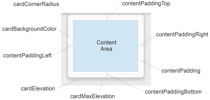
Каждый атрибут можно также изменить динамически, вызвав аналогичный CardView метод (Дополнительные сведения о CardView методах см. в CardView ). Обратите внимание, что эти атрибуты (за исключением цвета фона) принимают значение измерения, которое представляет собой десятичное число, за которым следует единица измерения. Например, 11.5dp задает 11,5 пикселей, не зависящих от плотности.
Заполнение
CardView предлагает пять атрибутов заполнения для размещения содержимого в карточке. Их можно задать в XML макета или вызвать аналогичные методы в коде:
Атрибуты заполнения объясняются следующим образом.
contentPadding — Внутреннее заполнение между дочерними представлениями CardView и всеми краями карты.
contentPaddingBottom — Внутреннее заполнение между дочерними представлениями CardView и нижней границей карты.
contentPaddingLeft — Внутреннее заполнение между дочерними представлениями CardView и левым краями карточки.
contentPaddingRight — Внутреннее заполнение между дочерними представлениями CardView и правой границей карты.
contentPaddingTop — Внутреннее заполнение между дочерними представлениями CardView и верхним краями карточки.
Атрибуты заполнения содержимого зависят от границы области содержимого, а не от какого-либо заданного мини-приложения, расположенного в области содержимого. Например, если contentPadding в приложении для просмотра фотографий было достаточное увеличение, то CardView будет обрезать изображение и текст, отображаемый на карточке.
Elevation
CardView предлагает два атрибута повышения прав для управления его повышением прав и, в результате, размер его тени:
Атрибуты повышения прав описаны ниже.
cardElevation — Повышение уровня CardView (представляет свою ось Z).
cardMaxElevation — Максимальное значение CardView повышения прав.
Большие значения cardElevation увеличивают размер тени, чтобы сделать его CardView более подходящим, чем верх фона. cardElevation Атрибут также определяет порядок рисования перекрывающихся представлений, то есть CardView будет отображаться под другим перекрывающимся представлением с более высоким уровнем повышения прав и над всеми перекрывающимися представлениями с более низким значением повышения прав. Этот cardMaxElevation параметр полезен при динамическом изменении повышения прав приложения. Это предотвращает расширение тени за пределами, заданными с помощью этого параметра.
Радиус и цвет фона угла
CardView предоставляет атрибуты, которые можно использовать для управления радиусом его угла и его цветом фона. Эти два свойства позволяют изменить общий стиль CardView :
Эти атрибуты объясняются следующим образом.
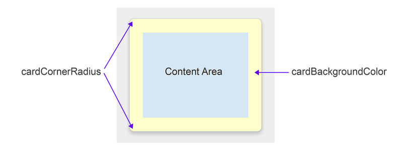
cardCornerRadius — Радиус угла всех углов CardView .
cardBackgroundColor — Цвет фона для объекта CardView .
На этой диаграмме cardCornerRadius для задано более скругленное 10dp, а cardBackgroundColor для параметра задано значение «#FFFFCC» (светло-желтый).
Совместимость
Вы можете использовать CardView более ранние версии Android, чем android 5,0 без описания операций. Поскольку CardView является частью библиотеки поддержки Android версии 7, вы можете использовать CardView с Android 2,1 (API уровня 7) и более поздней версии. Однако пакет необходимо установить, Xamarin.Android.Support.v7.CardView как описано в разделе Xamarin.Android.Support.v7.CardView выше.
CardView При работе с устройствами происходит немного другое поведение (уровень API 21):
CardView использует программную реализацию теневой копии, которая добавляет дополнительное дополнение.
CardView не обрезает дочерние представления, пересекающие CardView скругленные углы.
Чтобы упростить управление этими различиями в совместимости, CardView предоставляет несколько дополнительных атрибутов, которые можно настроить в макете:
cardPreventCornerOverlap — Задайте для этого атрибута значение true , чтобы добавить заполнение при выполнении приложения в более ранних версиях Android (уровень API 20 и более ранние версии). Этот параметр предотвращает CardView пересечение содержимого со CardView скругленными углами.
cardUseCompatPadding — Задайте для этого атрибута значение true , чтобы добавить заполнение при запуске приложения в версиях Android с уровнем API 21 или выше. Если вы хотите использовать на устройствах с предварительно заданными версиями CardView и они выглядят одинаково в параметре без описания операций (или более поздней версии), присвойте этому атрибуту значение true . Если этот атрибут включен, CardView добавляет дополнительное дополнение для рисования теней при запуске на устройствах с предварительной обначальным интерфейсом. Это помогает преодолеть различия в заполнении, которые появились, когда вступают в действие предварительные реализации программных теневых теней.
Дополнительные сведения о поддержке совместимости с более ранними версиями Android см. в разделе поддержание совместимости.
Итоги
В этом руководством появился новый мини-приложение, CardView входящее в Android 5,0 (без описания операций). Он демонстрирует внешний вид по умолчанию CardView и объясняет, как настраивать CardView его, изменяя его повышение прав, Скругление углов, заполнение содержимого и цвет фона. В нем перечислены CardView атрибуты макета (со схемами-образцами) и описано использование CardView на устройствах Android, более ранних, чем Android 5,0 без описания операций. Дополнительные сведения о CardView см. в CardView .
Источник
Xamarin.Android CardView
The Cardview widget is a UI component that presents text and image content in views that resemble cards. This guide explains how to use and customize CardView in Xamarin.Android applications while maintaining backward compatibility with earlier versions of Android.
Overview
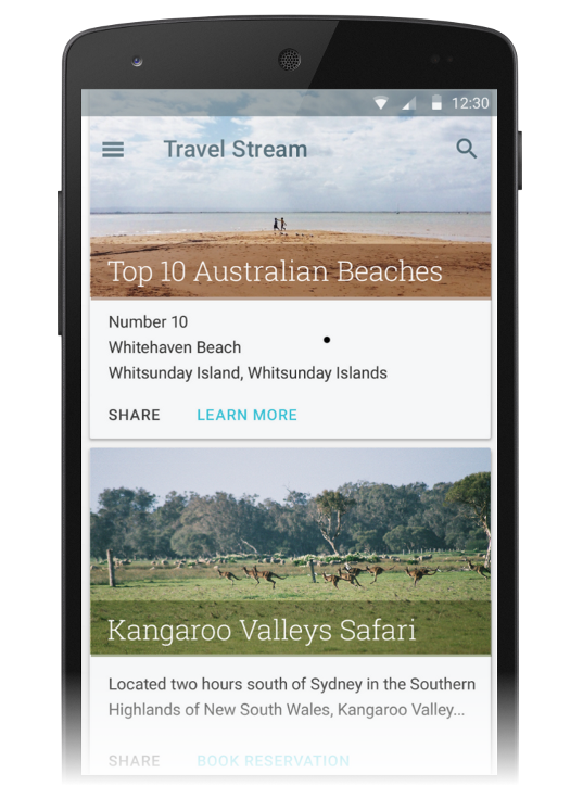
The Cardview widget, introduced in Android 5.0 (Lollipop), is a UI component that presents text and image content in views that resemble cards. CardView is implemented as a FrameLayout widget with rounded corners and a shadow. Typically, a CardView is used to present a single row item in a ListView or GridView view group. For example, the following screen shot is an example of a travel reservation app that implements CardView -based travel destination cards in a scrollable ListView :
This guide explains how to add the CardView package to your Xamarin.Android project, how to add CardView to your layout, and how to customize the appearance of CardView in your app. In addition, this guide provides a detailed list of CardView attributes that you can change, including attributes to help you use CardView on versions of Android earlier than Android 5.0 Lollipop.
Requirements
The following is required to use new Android 5.0 and later features (including CardView ) in Xamarin-based apps:
Xamarin.Android – Xamarin.Android 4.20 or later must be installed and configured with either Visual Studio or Visual Studio for Mac.
Android SDK – Android 5.0 (API 21) or later must be installed via the Android SDK Manager.
Java JDK 1.8 – JDK 1.7 can be used if you are specifically targeting API level 23 and earlier. JDK 1.8 is available from Oracle.
Your app must also include the Xamarin.Android.Support.v7.CardView package. To add the Xamarin.Android.Support.v7.CardView package in Visual Studio for Mac:
Open your project, right-click Packages and select Add Packages.
In the Add Packages dialog, search for CardView.
Select Xamarin Support Library v7 CardView, then click Add Package.
To add the Xamarin.Android.Support.v7.CardView package in Visual Studio:
Open your project, right-click the References node (in the Solution Explorer pane) and select Manage NuGet Packages. .
When the Manage NuGet Packages dialog is displayed, enter CardView in the search box.
When Xamarin Support Library v7 CardView appears, click Install.
To learn how to configure an Android 5.0 app project, see Setting Up an Android 5.0 Project. For more information about installing NuGet packages, see Walkthrough: Including a NuGet in your project.
Introducing CardView
The default CardView resembles a white card with minimally rounded corners and a slight shadow. The following example Main.axml layout displays a single CardView widget that contains a TextView :
If you use this XML to replace the existing contents of Main.axml, be sure to comment out any code in MainActivity.cs that refers to resources in the previous XML.
This layout example creates a default CardView with a single line of text as shown in the following screen shot:
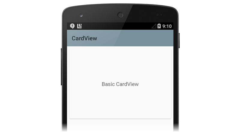
In this example, the app style is set to the light Material Theme ( Theme.Material.Light ) so that the CardView shadows and edges are easier to see. For more information about theming Android 5.0 apps, see Material Theme. In the next section, we’ll learn how to customize CardView for an application.
Customizing CardView
You can modify the basic CardView attributes to customize the appearance of the CardView in your app. For example, the elevation of the CardView can be increased to cast a larger shadow (which makes the card seem to float higher above the background). Also, the corner radius can be increased to make the corners of the card more rounded.
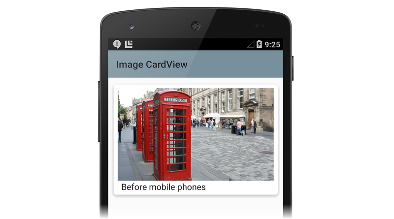
In the next layout example, a customized CardView is used to create a simulation of a print photograph (a «snapshot»). An ImageView is added to the CardView for displaying the image, and a TextView is positioned below the ImageView for displaying the title of the image. In this example layout, the CardView has the following customizations:
- The cardElevation is increased to 4dp to cast a larger shadow.
- The cardCornerRadius is increased to 5dp to make the corners appear more rounded.
Because CardView is provided by the Android v7 support library, its attributes are not available from the android: namespace. Therefore, you must define your own XML namespace and use that namespace as the CardView attribute prefix. In the layout example below, we will use this line to define a namespace called cardview :
You can call this namespace card_view or even myapp if you choose (it’s accessible only within the scope of this file). Whatever you choose to call this namespace, you must use it to prefix the CardView attribute that you want to modify. In this layout example, the cardview namespace is the prefix for cardElevation and cardCornerRadius :
When this layout example is used to display an image in a photo viewing app, the CardView has the appearance of a photo snapshot, as depicted in the following screenshot:

This screenshot is taken from the RecyclerViewer sample app, which uses a RecyclerView widget to present a scrolling list of CardView images for viewing photos. For more information about RecyclerView , see the RecyclerView guide.
Notice that a CardView can display more than one child view in its content area. For example, in the above photo viewing app example, the content area is comprised of a ListView that contains an ImageView and a TextView . Although CardView instances are often arranged vertically, you can also arrange them horizontally (see Creating a Custom View Style for an example screenshot).
CardView Layout Options
CardView layouts can be customized by setting one or more attributes that affect its padding, elevation, corner radius, and background color:

Each attribute can also be changed dynamically by calling a counterpart CardView method (for more information on CardView methods, see the CardView class reference). Note that these attributes (except for background color) accept a dimension value, which is a decimal number followed by the unit. For example, 11.5dp specifies 11.5 density-independent pixels.
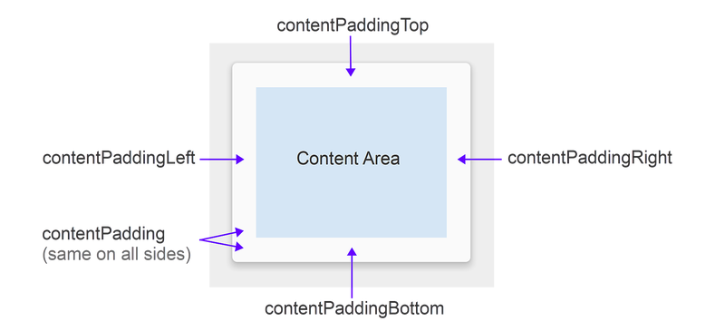
Padding
CardView offers five padding attributes to position content within the card. You can set them in your layout XML or you can call analogous methods in your code:

The padding attributes are explained as follows:
contentPadding – Inner padding between the child views of the CardView and all edges of the card.
contentPaddingBottom – Inner padding between the child views of the CardView and the bottom edge of the card.
contentPaddingLeft – Inner padding between the child views of the CardView and the left edge of the card.
contentPaddingRight – Inner padding between the child views of the CardView and the right edge of the card.
contentPaddingTop – Inner padding between the child views of the CardView and the top edge of the card.
Content padding attributes are relative to the boundary of the content area rather than to any given widget located within the content area. For example, if contentPadding were sufficiently increased in the photo viewing app, the CardView would crop both the image and the text shown on the card.
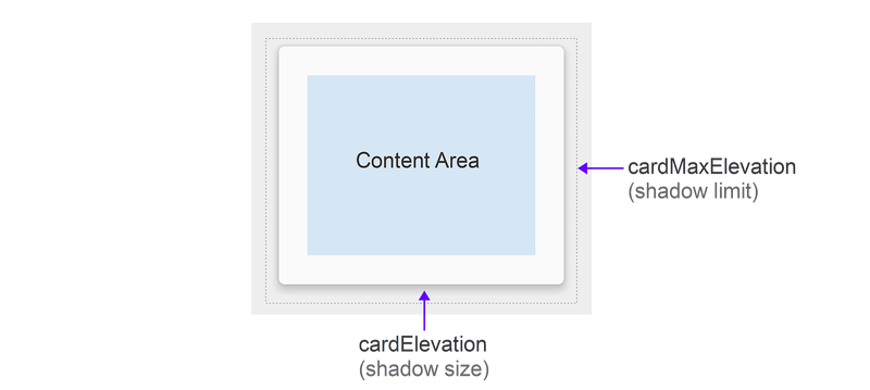
Elevation
CardView offers two elevation attributes to control its elevation and, as a result, the size of its shadow:

The elevation attributes are explained as follows:
cardElevation – The elevation of the CardView (represents its Z axis).
cardMaxElevation – The maximum value of the CardView ‘s elevation.
Larger values of cardElevation increase the shadow size to make CardView seem to float higher above the background. The cardElevation attribute also determines the drawing order of overlapping views; that is, the CardView will be drawn under another overlapping view with a higher elevation setting and above any overlapping views with a lower elevation setting. The cardMaxElevation setting is useful for when your app changes elevation dynamically – it prevents the shadow from extending past the limit that you define with this setting.
Corner Radius and Background Color
CardView offers attributes that you can use to control its corner radius and its background color. These two properties allow you change the overall style of the CardView :

These attributes are explained as follows:
cardCornerRadius – The corner radius of all corners of the CardView .
cardBackgroundColor – The background color of the CardView .
In this diagram, cardCornerRadius is set to a more rounded 10dp and cardBackgroundColor is set to «#FFFFCC» (light yellow).
Compatibility
You can use CardView on versions of Android earlier than Android 5.0 Lollipop. Because CardView is part of the Android v7 support library, you can use CardView with Android 2.1 (API level 7) and higher. However, you must install the Xamarin.Android.Support.v7.CardView package as described in Requirements, above.
CardView exhibits slightly different behavior on devices before Lollipop (API level 21):
CardView uses a programmatic shadow implementation that adds additional padding.
CardView does not clip child views that intersect with the CardView ‘s rounded corners.
To help in managing these compatibility differences, CardView provides several additional attributes that you can configure in your layout:
cardPreventCornerOverlap – Set this attribute to true to add padding when your app is running on earlier Android versions (API level 20 and earlier). This setting prevents CardView content from intersecting with the CardView ‘s rounded corners.
cardUseCompatPadding – Set this attribute to true to add padding when your app is running in versions of Android at or greater than API level 21. If you want to use CardView on pre-Lollipop devices and have it look the same on Lollipop (or later), set this attribute to true . When this attribute is enabled, CardView adds additional padding to draw shadows when it runs on pre-Lollipop devices. This helps to overcome the differences in padding that are introduced when pre-Lollipop programmatic shadow implementations are in effect.
For more information about maintaining compatibility with earlier versions of Android, see Maintaining Compatibility.
Summary
This guide introduced the new CardView widget included in Android 5.0 (Lollipop). It demonstrated the default CardView appearance and explained how to customize CardView by changing its elevation, corner roundness, content padding, and background color. It listed the CardView layout attributes (with reference diagrams), and explained how to use CardView on Android devices earlier than Android 5.0 Lollipop. For more information about CardView , see the CardView class reference.
Источник


